Risk360
ROLES
USERS
DURATION
Project Overview
Risk360: Seamless Integration of Risk Management into Business Operations
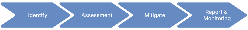
Risk360, offered by Beehive Technology, is a comprehensive risk management suite designed for department heads, directors, and senior executives, encompassing every aspect of risk management—from identification and evaluation to monitoring and reporting.
The app plays a crucial role in flagging internal and external threats, supporting compliance efforts and board meetings, and enabling the development of holistic strategies and effective mitigation measures, all while leveraging insights from its detailed reports and dashboard.
Project Results
Overall, Risk360 has helped clients embed risk management processes into their day-to-day operations.
+90%
faster in creating reports
+25%
risks identified
+40%
policies & controls created
The project is now fully operational, managing hundreds of risks across Swire’s subsidiaries, including HAECO, Cathay Pacific, Swire Coca-Cola, and Swire Properties. It is regularly used for the following purposes:
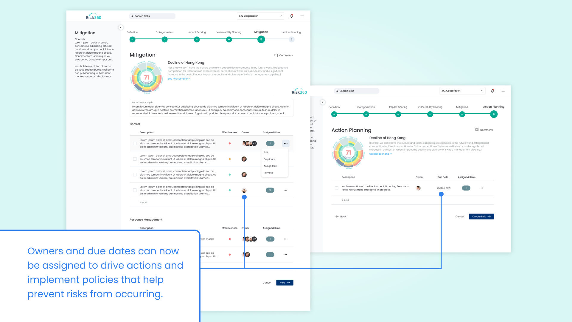
First Problem
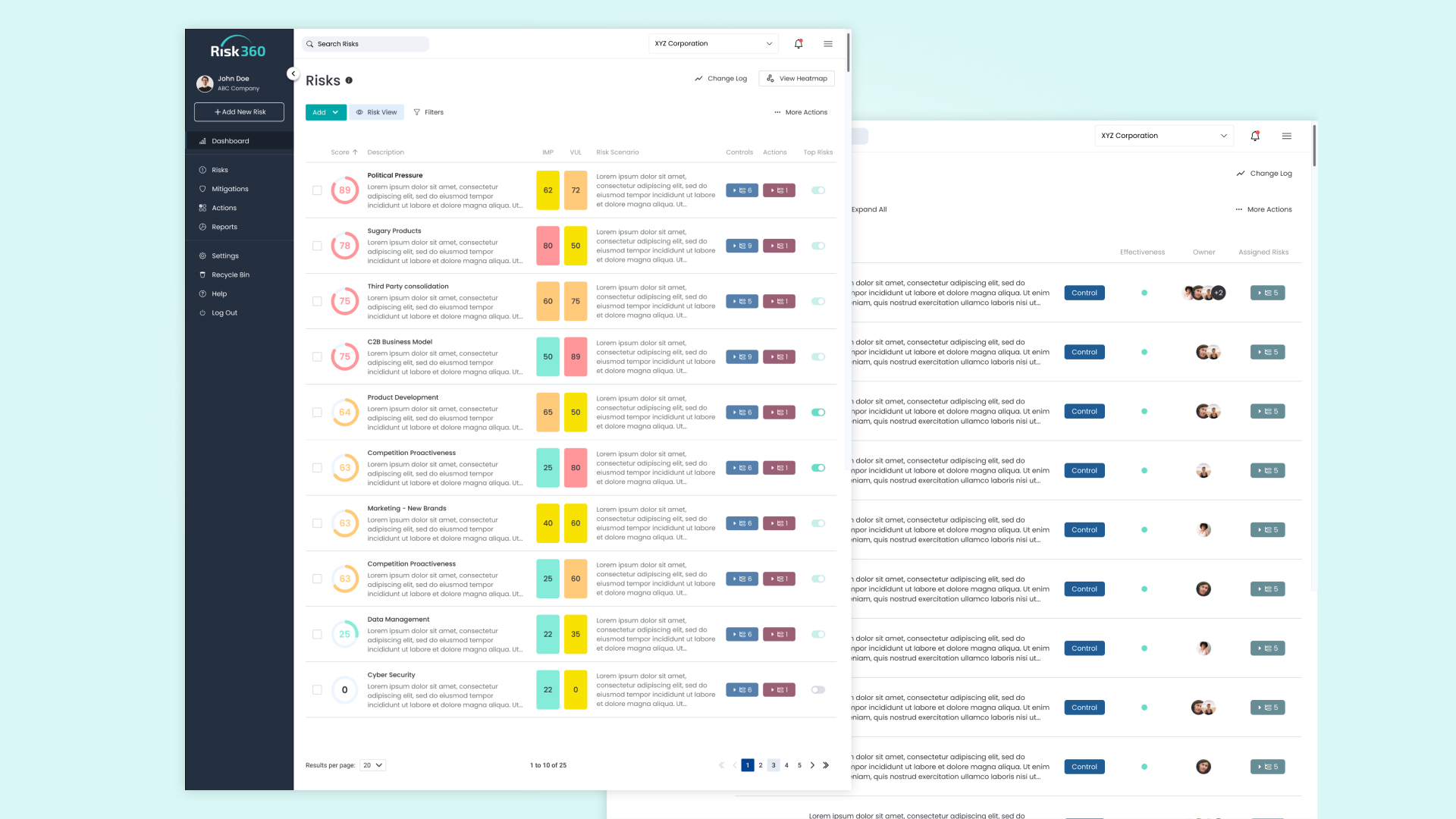
The system lacks features to assign ownership and accountability for risks.
The early version of Risk360 was primarily used for documenting and assessing risks during workshops. It lacked features that allowed users to take ownership of risks and drive necessary initiatives and actions.
First Solution
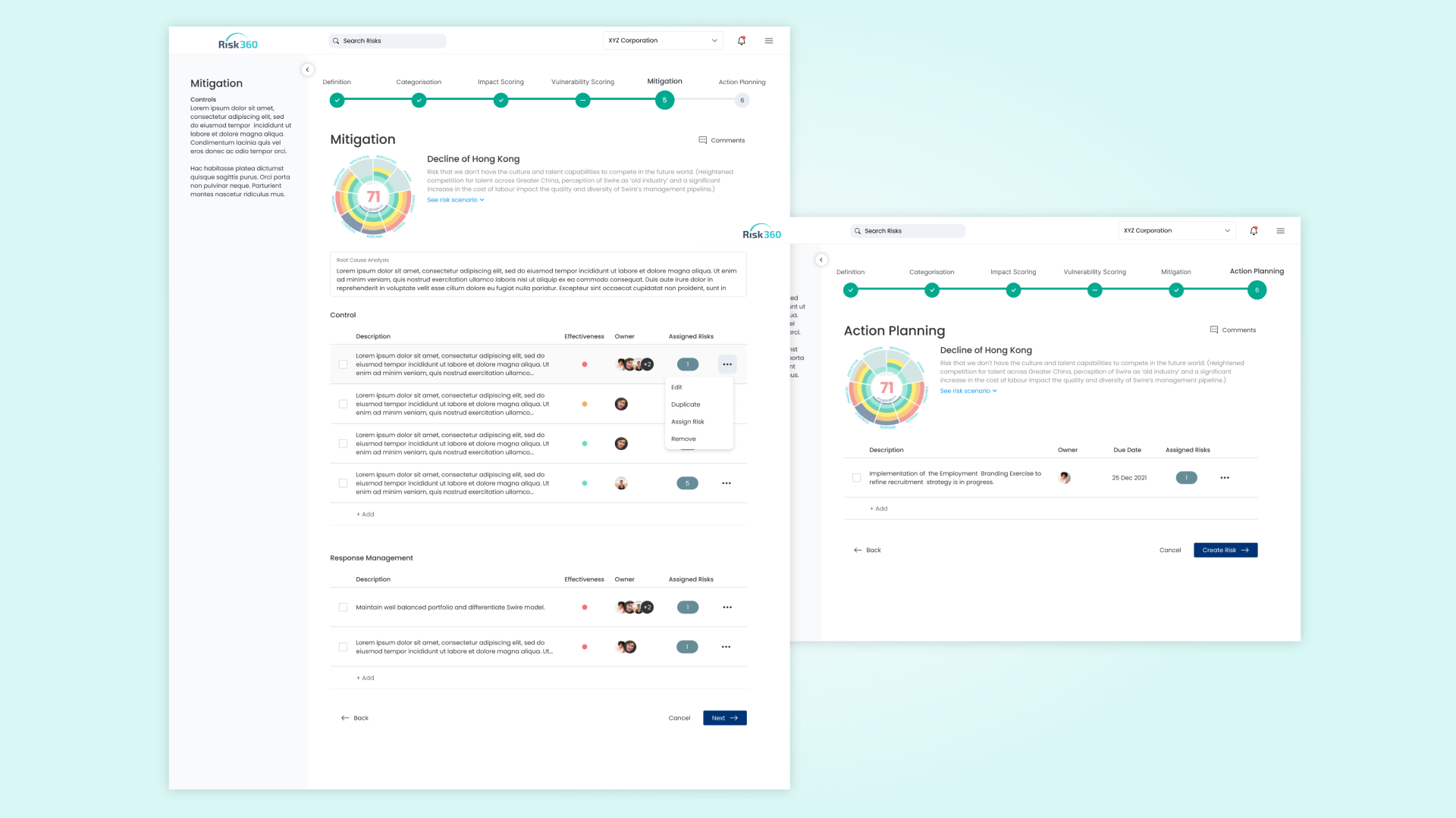
Risk360: empowering users to own risks and drive actions, ensuring the protection of the organization.
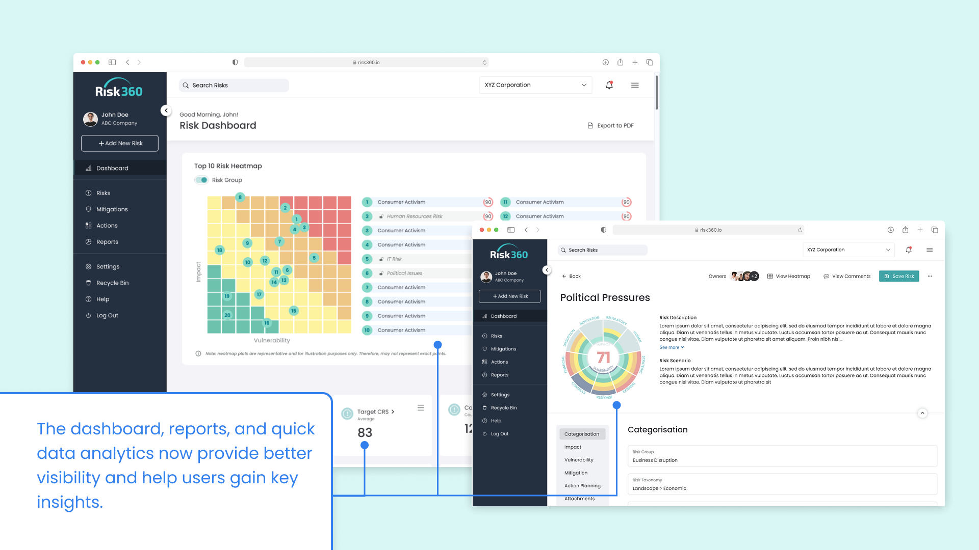
Second Problem
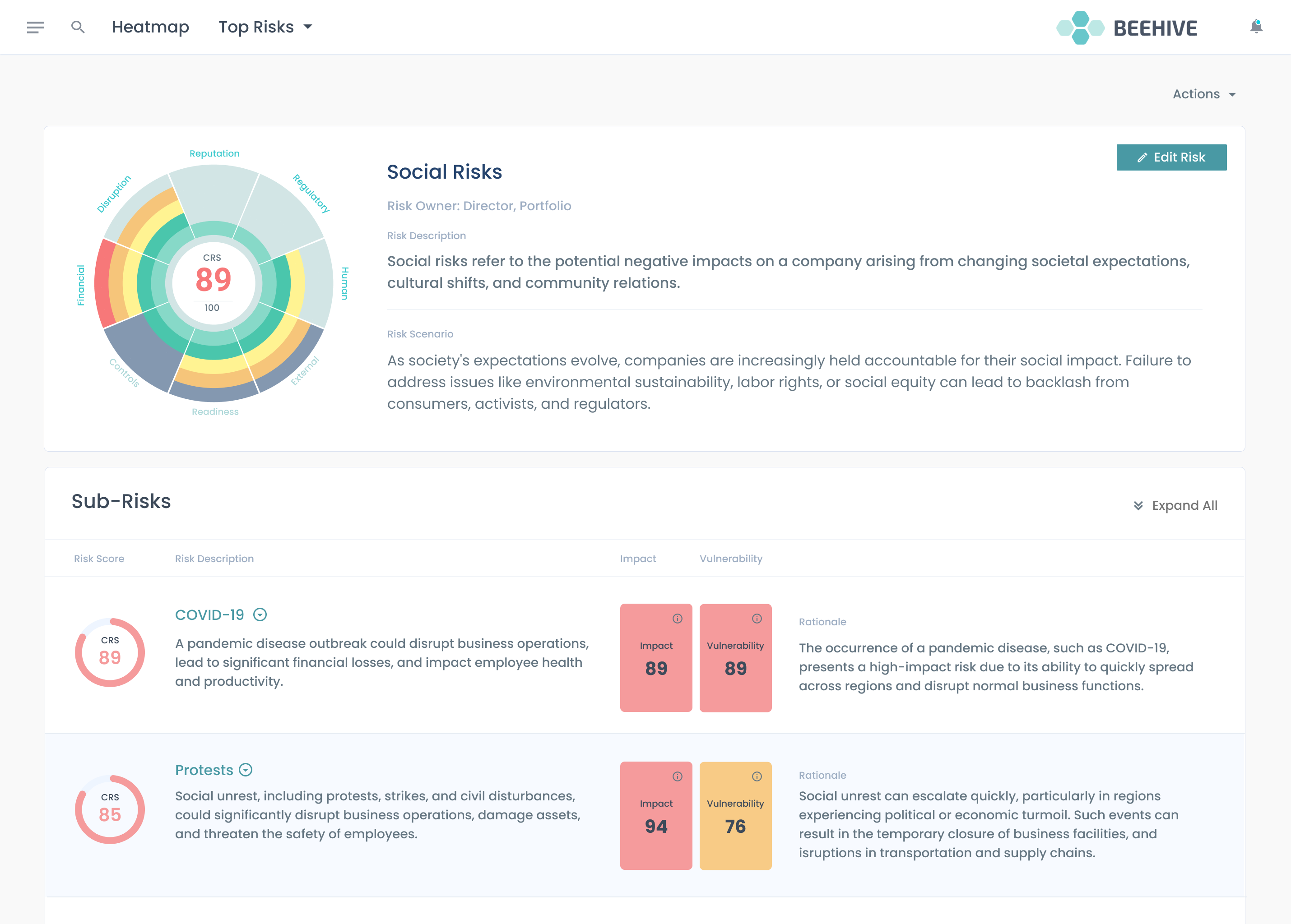
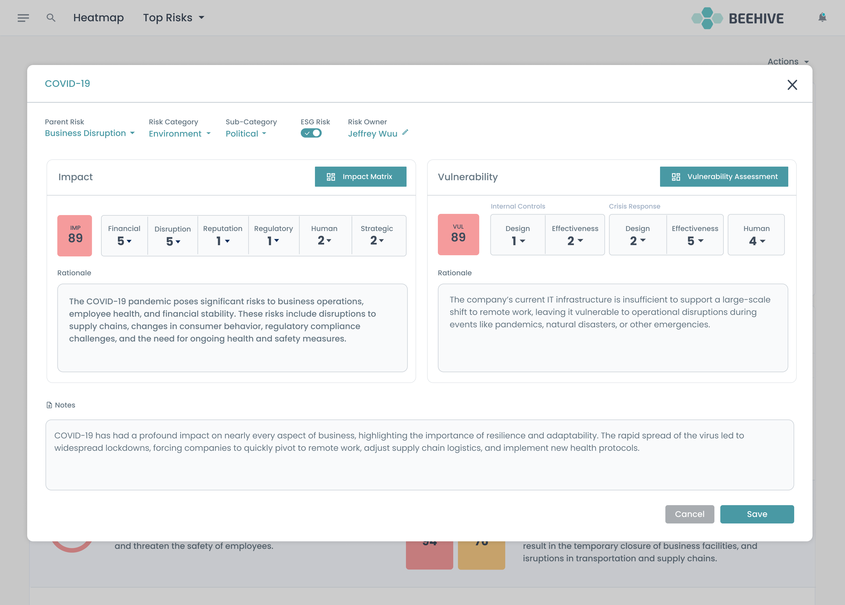
Users needed to view relevant risks to draw key conclusions.
Users required a clear, holistic view of the risks across the organization they are concerned. They need key insights and make informed decisions.
Second Solution
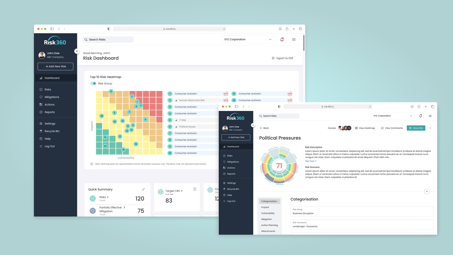
Risk360: Providing visibility to manage risks, from subsidiaries to parent companies.
Third Problem
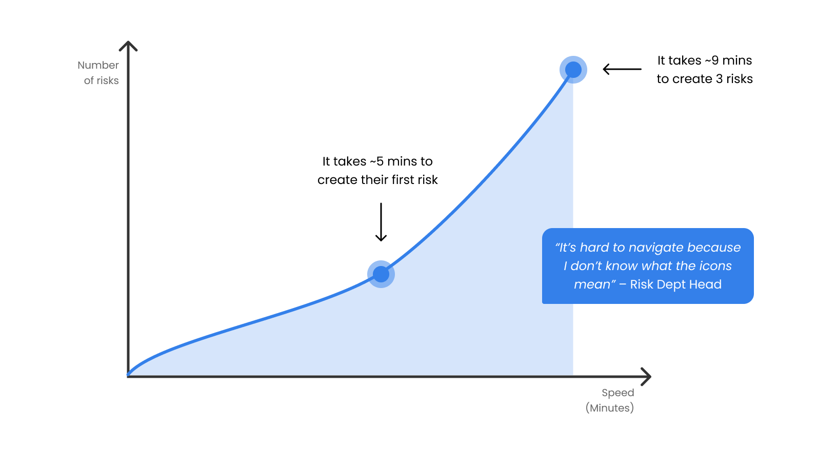
Users had to expend cognitive effort to understand the icons and were confused about where everything was.
Director-level users found it cognitively demanding to understand the icons, leading to navigational challenges and frustration. The absence of navigation hints and guides made it difficult for users to complete their tasks.
Third Solution
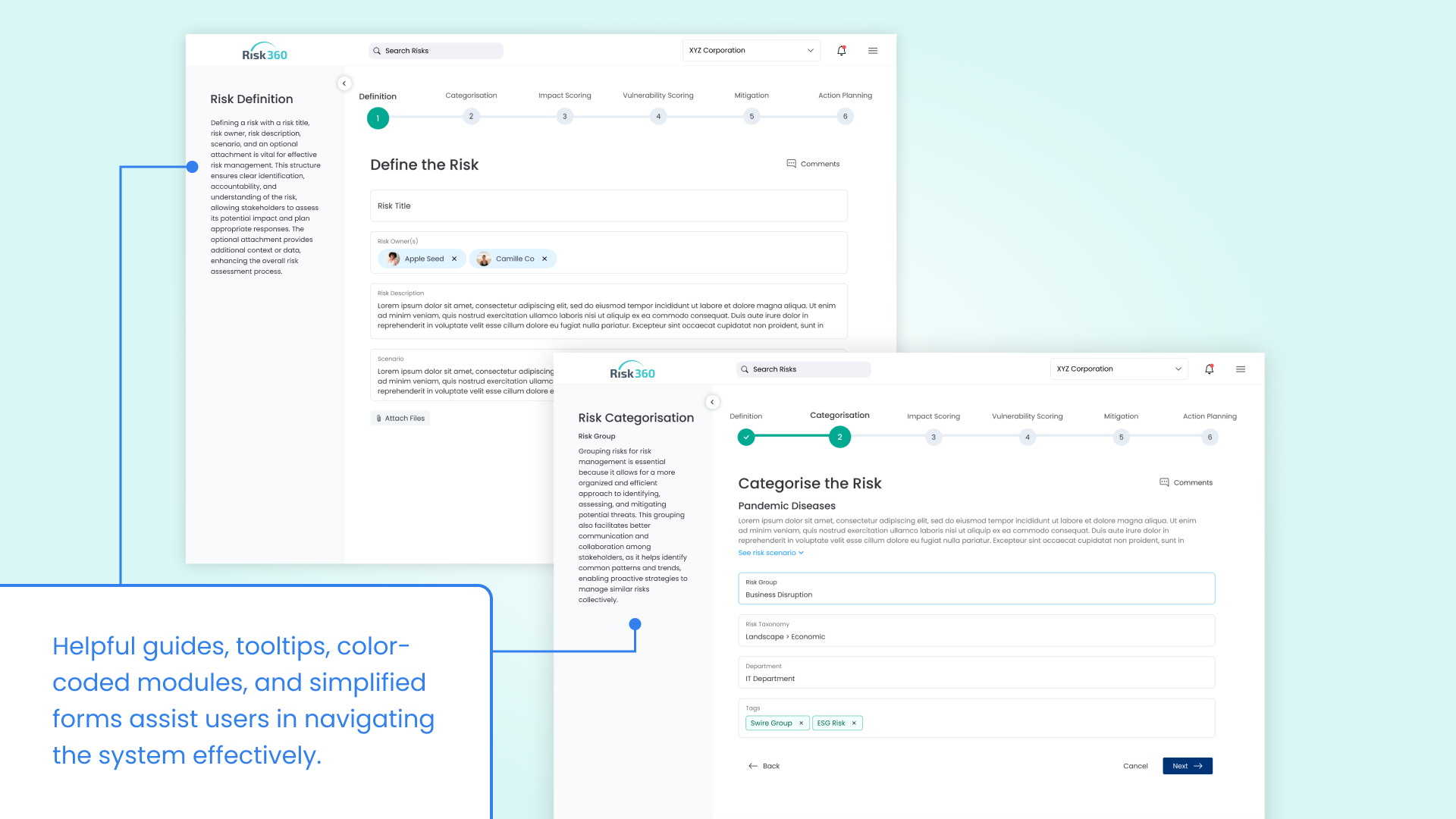
Risk360: A guided and user-friendly risk management solution
The redesigned Risk360 features tooltips, helpful guides, color-coded modules, and button labels to guide users in managing and preventing risks from materializing, thereby increasing usability and making the system more user-friendly.
Preparation
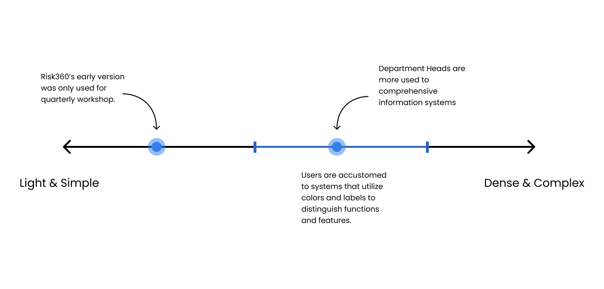
Risk360’s early version was used for conducting workshops, helping enterprises identify and assess risks
Before the project began, the company had already developed a functional prototype of a simple risk management app. This early version was used by risk directors to conduct workshops, identify and assess risks, leveraging Beehive’s bespoke risk management methodology.
Gathering insights from the prototype was crucial in iterating it into a more holistic and user-friendly information system.
Empathy & Definition
Understanding users through interviews and immersion
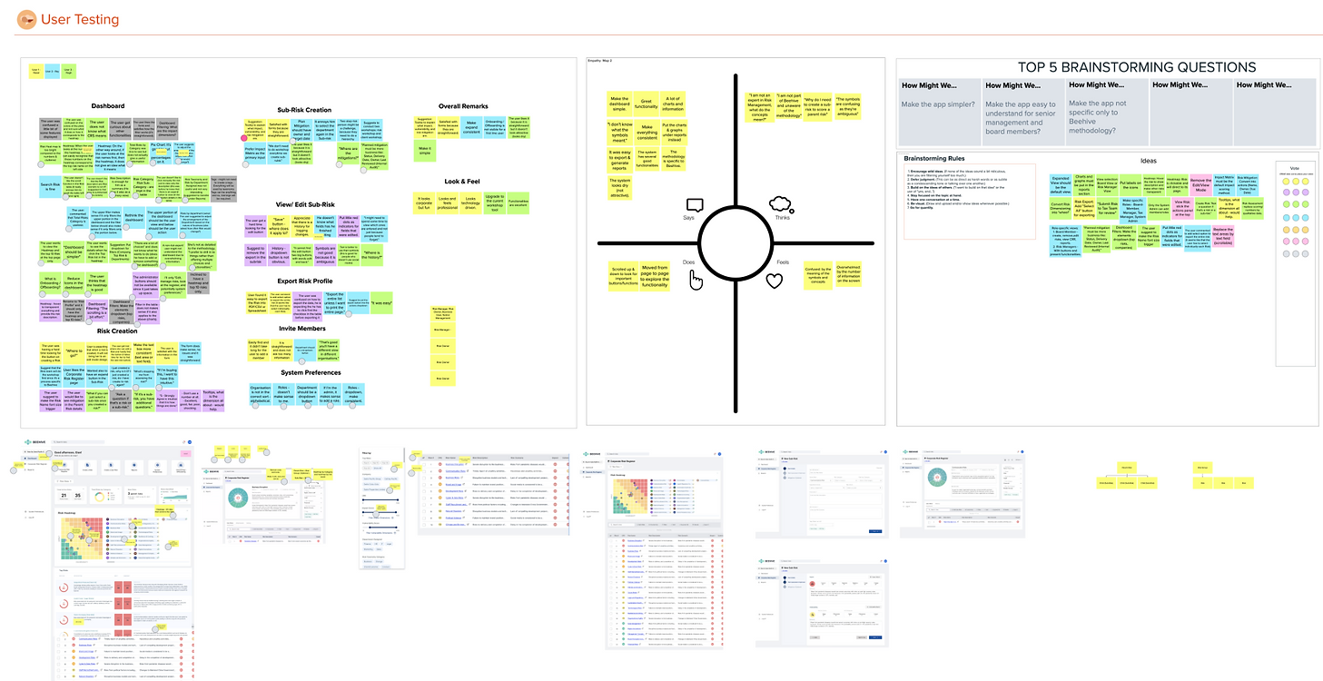
To understand daily usage, I conducted user testing with five representatives via Zoom, selected for their senior roles and 15+ years of industry experience. I also observed their workflows by attending risk management workshops and assisting with manual risk report creation. The insights were analyzed in a workshop I led with five developers and analysts, using empathy and affinity maps to deepen our understanding of users. The key problems identified were:
Cognitive Overload
Users struggled with the overwhelming amount of information and the non-intuitive icon buttons, leading to frustration.
Need for Visibility
Risk experts require a clear, holistic view of the risks across the entire organization to make informed decisions.
Lacks to inspire action
Department Heads needed to drive action by assigning responsibilities, setting due dates, and ensuring transparency across all risks.
Interestingly, the users may have difficulty processing icons, but they responded faster with colors due to the current systems and workflows in place.
Ideation
Analysing key insights to ideate solutions
The team brainstormed solutions, beginning with the following “How might we” questions to generate ideas:
Interface
How might we make the UI friendly for director-level users, so they can use Risk360 everyday for operations?
Visibility
How might we establish visibility across the entire organization, including its subsidiaries, from a risk management standpoint?
Actions
How might we drive actions and visibility in risk management?
Through a voting process and feasibility assessments, we identified the following ideas for prototyping and development:
I also developed a sitemap to show navigation and content for each page, guiding the design and development processes (The sitemap however cannot be shared for security purposes).
Prototyping & Development
Bringing ideas to life
I used Figma to design components and medium-fidelity prototypes, working closely with the development teams and CEO to ensure that the prototype was feasible and met risk management standards. I also designed an app logo that signifies a holistic view of the corporation’s risks. The following laws of UX were applied:
Aesthetic-Usability Effect
The design is enjoyable, interactive, and pleasing to influence positive emotions.
Zeigarnik Effect
Forms were divided into several steps, with a progress bar to signify success. In-line validations were implemented to help users correct data firsthand.
Hick’s Law
The number of options and buttons was reduced to focus on what’s most important.
Reflection
The Risk360 project was my first and most significant project for major international clients. As the sole UX/UI Designer in the company, I gained valuable insights: